
"Vision and Mission"
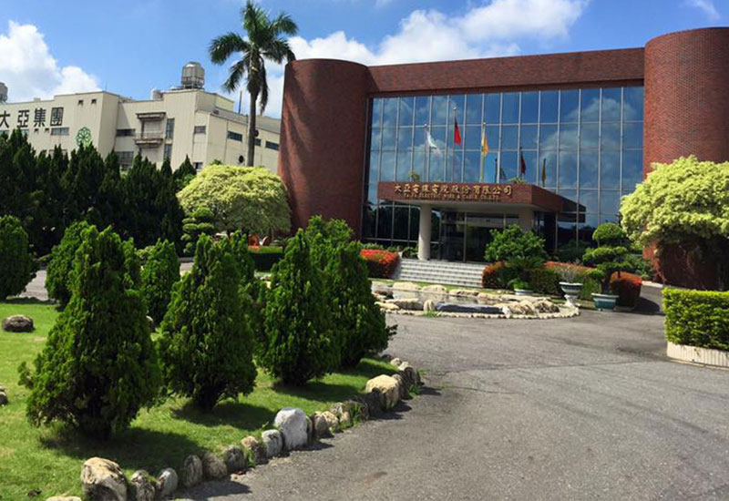
1955 - "Ta Ya Enterprise," the Company's former entity, was founded in Tainan City. 1967 - Changed name to Ta Ya Electric Wire & Cable Co., Ltd., and began production of magnet wires in addition to high-voltage rubber-insulated cables. 1986 - Relocated to the current address at Kuan Miao Dist. With a headquarter in Taiwan, Ta Ya has since begun constructing production facilities in China and Vietnam. In the last 60 years, the Company was fortunate to have a team of employees who worked diligently with mutual benefit, and who are constantly exploring and seeking diversification into new businesses.
Vision
To become
- A leading brand in energy connection
- A creator of harmonious environment and pristine homeland
- A business trusted by employees, customers, shareholders, and society
Core values
Mission: Enlightened Employees, Satisfied Customers, Positive Shareholders, and Pristine Homeland
Business philosophy
Continuous improvements
Through ongoing learning, progress, and improvement of quality, technology, process, costs and services, we make our "persistence in quality" one of our strongest reputations.
Mutual benefits
Work as a team and create sustainable and shared benefits for society, the customers, shareholders and business partners based on the value of "respect for the environment, harmonious relations, and mutual gains."
Pragmatism
Adhere to the integrity principle and devote full effort once a commitment is made. Clarify goals, assume responsibilities, resolve to pragmatic solutions, raise efficiency, tend to details, and maximize effort for the best results.
Innovation & changes
Innovation is the force that drives growth. It motives people to constantly think in introspection, search for opportunities, embrace challenges, change with time, and transform the industry with visionary ideas.
Brand management
Despite being a 60-year old business, Ta Ya continues to move forward and expand into the world. The Company has given its logo a complete new design, presenting the name Ta Ya with a metallic, copper-ish color in addition to the traditional red to symbolize sustainability and the Company's specialty in metals. The pen stroke resembles the figure of a dragon with its head turned back, which implies respect to our legacy. The group has adopted the brand value of "Sustainability through Technology," and the new logo provides Ta Ya with a new corporate image, one that includes tradition and modernism. The brand logo is designed based on the name TAYA. It features a single stroke turning and twisting to resemble the shape of a rising dragon. The use of red symbolizes Ta Ya's transcendent spirit, while a copper-ish color was added to stress the Company's specialty in the cable business and its emphasis on innovation. Chinese characters in the logo were printed in black, and have been refined and adjusted into a style that is exclusive and most appropriate for our image as a modern, professional business.